
Home decor color schemes – are a foundational aspect of interior design, shaping the atmosphere, mood, and visual appeal of any space. Colors have a profound impact on how we perceive and experience a room, influencing everything from our emotions to the way light is reflected or absorbed in the space. By understanding color theory and the psychological effects of different hues, you can create a home environment that aligns with your personal style, enhances comfort, and transforms your space into a reflection of your individuality.
In this comprehensive guide, we’ll explore the fundamentals of color theory, delve into popular home decor color schemes, and offer insights into how you can use these schemes to craft a balanced, beautiful, and functional living space. We’ll also touch on current color trends, tips for incorporating accent colors, and the relationship between lighting and color in interior design.
Table of Contents
ToggleUnderstanding Color Theory and Psychology in Home Decor
Color theory is the study of how colors interact with one another, the relationships between them, and how these relationships can be harnessed to create specific visual effects. It also incorporates an understanding of the emotional and psychological responses different colors evoke, making it an essential tool in interior design.
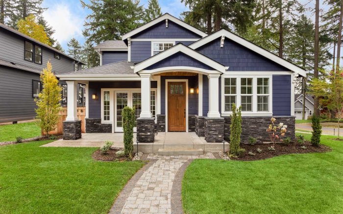
/choosing-interior-paint-colors-4011484-007-b567461297e44c4f8a84f1088e1f40ea.jpg?w=700)
Warm vs. Cool Colors
Colors are often categorized into two broad categories: warm and cool. Each category brings a distinct atmosphere to a room.
- Warm Colors: This includes hues like red, orange, and yellow. These colors are often associated with energy, passion, and warmth. In a room, warm colors can make a space feel more inviting and cozy, perfect for communal areas like living rooms or dining spaces. Red, for instance, can evoke excitement and even increase heart rate, making it a bold choice for social spaces.
- Cool Colors: On the opposite side of the spectrum are blues, greens, and purples. These colors tend to evoke a sense of calm, relaxation, and tranquility. Cool colors work well in spaces meant for rest or contemplation, such as bedrooms or bathrooms. Blue is often linked to feelings of serenity and is known to lower stress levels, making it ideal for peaceful retreats within the home.
Neutrals
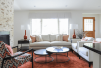
Neutral colors, including white, black, gray, and beige, play a crucial role in home decor. They are versatile, providing balance to brighter or bolder hues. Neutrals are often used as the foundation of a color scheme, offering a timeless backdrop that can be layered with accent colors to create depth and interest. For instance, a predominantly white room can feel clean and open, but adding pops of color through accessories or artwork prevents the space from feeling sterile.
Neutrals also have psychological effects; white can signify purity and simplicity, while black evokes elegance and sophistication. Gray, a mix of black and white, is particularly versatile and can shift between warm and cool tones depending on the undertones, making it a favorite in modern, minimalist design.
Popular Home Decor Color Schemes
There are several ways to combine colors in home decor, each creating a different mood and visual impact. The most commonly used color schemes in interior design are monochromatic, complementary, and analogous.
1. Monochromatic Color Schemes
A monochromatic scheme involves using various shades, tints, and tones of a single color. This creates a harmonious and sophisticated look, ideal for those who want a minimalist and elegant aesthetic. For instance, a monochromatic blue room could feature navy walls, a sky-blue rug, and pale blue accents. The variation in shades keeps the space from feeling flat while maintaining a cohesive, serene look.
Monochromatic schemes are excellent for creating a calming, unified space. They also allow for easy coordination of decor elements, from furniture to wall art, without the risk of clashing colors.
2. Complementary Color Schemes
Complementary colors are pairs of hues that sit opposite each other on the color wheel, such as red and green, blue and orange, or yellow and purple. Using complementary colors in your decor creates high contrast and a dynamic visual effect. This approach is perfect for those looking to make a bold statement and inject energy into a room.
For example, pairing a deep navy wall with bright orange throw pillows can create a striking contrast that feels both sophisticated and lively. This color scheme is ideal for spaces where you want to create visual excitement, such as in a living room or home office.
3. Analogous Color Schemes
Analogous color schemes involve using colors that are adjacent to each other on the color wheel, such as red, orange, and yellow or blue, green, and teal. This type of color scheme creates a cohesive and visually pleasing look, as the colors naturally complement one another without the stark contrast of complementary colors.
For example, in a bedroom, you might use a gradient of green, teal, and blue to create a peaceful, flowing ambiance. Analogous schemes are often found in nature, which is why they evoke a sense of harmony and serenity. They are an excellent choice for rooms where you want to create a soothing, cohesive environment, such as a bedroom or bathroom.
Color Combinations and Their Effects
Below is a breakdown of common color combinations and the atmosphere they help create in a home:
| Color Family | Combination | Effect |
|---|---|---|
| Warm Colors | Red, orange, yellow | Creates a sense of warmth, energy, and excitement |
| Cool Colors | Blue, green, purple | Evokes calm, tranquility, and serenity |
| Neutrals | White, black, gray | Provides balance and sophistication; minimalist look |
| Complementary | Red and green, blue and orange, yellow and purple | High contrast; bold and visually striking |
| Analogous | Red, orange, yellow; blue, green, teal | Cohesive, harmonious, and soothing |
Current Color Trends in Home Decor
Color trends in home decor are constantly evolving, reflecting broader cultural shifts and design movements. While classic neutrals like white, gray, and beige remain popular, recent trends have seen a resurgence of more vibrant and expressive colors.
1. Earthy Tones
Earthy tones like muted greens, soft browns, and terracotta are making a strong comeback in interior design. These colors, inspired by nature, create a sense of grounding and warmth in a space. They are perfect for those looking to bring a sense of tranquility and organic beauty into their home.
2. Jewel Tones
Deep, saturated jewel tones such as emerald green, sapphire blue, and ruby red are also trending. These colors add richness and luxury to a room, making them ideal for statement pieces or accent walls. Jewel tones can be balanced with neutrals like gray or beige to prevent the space from feeling too heavy.
3. Pastels
Soft, muted shades of colors like blush pink, lavender, and mint green are perfect for creating a calming and gentle atmosphere. Pastels have been particularly popular in recent years, often used in Scandinavian-inspired designs that emphasize light, airy spaces.
Incorporating Accent Colors in Home Decor
Accent colors are essential for adding depth, personality, and visual interest to a room. While your primary color scheme provides the foundation, accent colors can be used sparingly to highlight certain areas or features.
Accent colors can be introduced through various decor elements:
- Furniture: A bright-colored sofa or armchair can serve as a focal point in a neutral room.
- Textiles: Throw pillows, rugs, and curtains are easy ways to incorporate accent colors without committing to major changes.
- Artwork: Wall art is an excellent way to bring in accent colors while adding personality to your space.
For example, in a room with a neutral color scheme, a bold yellow accent chair or a navy blue rug can instantly elevate the design and make the space feel more dynamic.
The Role of Lighting in Home Decor Color Schemes
Lighting is an often overlooked but crucial element of how colors are perceived in a room. Natural light tends to bring out the true tone of colors, while artificial light can change their appearance.
- Natural Light: Rooms with ample natural light allow colors to be seen in their truest form. For example, a room with large windows that let in natural sunlight will showcase the vibrancy of colors like yellow or green.
- Artificial Light: Different types of artificial light, whether warm or cool, can drastically alter the appearance of a color. A room lit by warm incandescent bulbs might make cool colors appear more muted, while a room with cool fluorescent lights can make warm colors look harsher.
When planning your color scheme, it’s essential to consider how both natural and artificial lighting will affect the way colors are perceived throughout the day.
Conclusion
Choosing the right color scheme for your home is an essential part of creating a space that reflects your style, mood, and personality. By understanding color theory and the psychological effects of different hues, you can make informed decisions that enhance the atmosphere of each room in your home.
From the soothing effects of cool blues and greens to the vibrant energy of warm reds and oranges, the right color combinations can transform your living space into a harmonious and inviting environment. Whether you opt for a monochromatic, complementary, or analogous color scheme, the possibilities are endless.
And by staying attuned to current trends like earthy tones, jewel hues, and pastels, you can ensure your home feels both contemporary and timeless.
Ultimately, the colors you choose for your home decor should make you feel comfortable, inspired, and at peace in your surroundings.
